Most of your website visitors are leaving your site and never contacting you. How do I know? Because that’s the story with every single client who comes to us – without exception.
Would you spend millions of dollars to purchase a store or office space in the best location in town, then use cheap and ugly interior design to furnish it? Or pile all your products on top of each other so no one can easily find what they’re looking for?
If you do, what happens?
Same analogy goes with your digital marketing.
You could spend thousands of dollars each month to secure your top position on Google (either through SEO or Adwords) and get customers to click on your ads or listing and land on your site. But if your site doesn’t load fast enough, is unorganized, has too much “stuff” or lacks clear calls-to-action, your visitors may never contact you.
This is happening to your site right now.
When a customer who has visited your site contacts you (through email or phone call or chat) we call that a conversion. Thus, a conversion rate of a site is the percentage of people who visit your site and decide to make that initial contact.
Conversion Rate Optimization (CRO) is not new. I wrote about it in 2010. But many things have changed since then and it’s time to take a very hard look at how your conversion rate is doing and how you can improve it.
Monitor Your Site’s Conversion Rates
96% of small businesses are not monitoring their sites’ conversion rates. No problem. Here are instructions on how to do that. But before you get set up, stop all digital marketing you’re spending money on until you do.
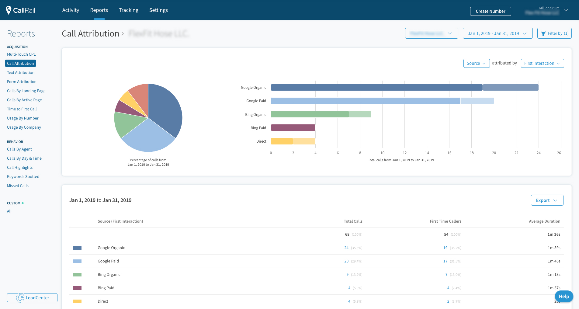
It is technically easy to monitor your calls if you know how to edit your site’s backend code. All you do is sign up with a service like CallRail.com and insert their script into your code. CallRail monitors all kinds of campaigns for you.
Then you’ll connect your Google Analytics to your CallRail and boom! you’re monitoring your site’s conversion rate.
Click on the image below to see how to do that.
Within a few days of collecting data – given that your site already has significant traffic – you can see how well your site is doing.
Conversion Rate Differs From Industry to Industry
Your site’s conversion rate is not good enough. But, how bad is it? We don’t know. We know it’s bad because no matter how good your site is, there is always room to improve it – significantly.
Also, conversion rates differ for each industry. If you own a pest control company, you may get a very high conversion rate just by having a simple call-to-action on your site with not much else to say. On the other hand, if you own a cake recipe site and sell some products on the side, you may get a very low conversion rate – because most of your visitors are there to learn and not to buy from you.
So, first know what your site’s conversion rate is, then improve it.
The Time Visitors Stay on Your Site Is Not a Conversion
I’ve seen it more than once that agencies monitor how long a person stays on a site and call that a conversion if it’s more than a minute, for example.
That’s simply not a conversion. Maybe that’s engagement. But we’re not talking about engagement here.
As I said above, a conversion happens when you get a new lead (or make a sale if you have an e-commerce site).
Higher Conversion Rates Mean Better SEO
We were pleasantly surprised to see improvements to our clients’ rankings and their sites’ traffic as soon as we improved their conversion rates.
Here is an example of a client’s improved traffic as a direct result of conversion rate optimization (CRO):

Monitor Your Local Conversion Rate vs. National or International
A good way to have more accurate numbers for your conversion rate is to calculate it based on the traffic that comes to your site from local results.
Google Analytics allows you to filter geographical data (GEO) so that you can narrow down your site’s visitors by country, state or city.
By doing so, you can calculate the state-level conversion rate, for example, as that would be a more accurate analysis for a local business like a plastic surgeon as opposed to calculating the total nationwide traffic that’s coming to the site.
Include Calls-to-Actions
Interestingly, most sites don’t include any CTAs at all. They simply put a phone number in the header of the site without saying anything else. Some don’t even have a phone number at the top of their sites.
Know Your Audience
Who is your target audience? In other words, who is your ideal customer? Identify that individual and learn about him/her as much as you can. What does she like? What motivates her? What’s she afraid of? How old is she?
By knowing your audience well, you can then target your message to her. People
like her (your ideal customers) will then be attracted to your business and are more likely to contact you
(higher conversion rate).
Target Your Audience
Now that you know who your ideal customer is, make sure you target her throughout the site. In other words, build the site entirely for her.
Images, content, and videos all must be built with one aim: having her contact you.
Increase Your Site’s Load-Speed
We used to say a site that takes more than three seconds to load is too slow and many visitors will leave (after all, our attention spans have decreased dramatically). Now, we have evidence to support that sites must load even faster.
Our team is working on techniques to have our clients’ sites load within one second. Faster loading sites create a better user experience (UX). We also have strong evidence to support that faster loading sites rank higher on Google.
One reason Google is rewarding fast loading sites is the fact that Google has to store all sites on its database for indexing purposes. And faster loading sites mean smaller sites. And smaller sites take less space on Google’s servers.
There’s no official data on how many servers there are in Google data centers, but Gartner estimated in a July 2016 report that Google at the time had 2.5 million servers. This number is always changing as the company expands capacity and refreshes its hardware. This means that Google’s server costs will increase constantly.
An effective way to decrease Google’s expense is by encouraging sites that are smaller and thus load faster.
We discuss increasing your site’s speed and multiple techniques you can use in our upcoming ebook.
Use Next Generation Photos
Webp is the next generation format for images. Google Chrome and Mozilla Firefox are fully supporting it and Apple Safari is not far behind.
So, add webp photos to your site and make sure Safari users are still able to see your old images. This is a very technical aspect of conversion rate optimization (CRO). If you’re not very technically inclined, ask your website developer for assistance.
Put Your Reviews on the Homepage
Not just reviews, but anything you want your audience to see. However, reviews are the most important elements to include on your site because they build trust.
Why do we suggest you put everything on the homepage? Because we want your visitor to easily access all the information. Scrolling is always easier than clicking.
One-Click Access
The distance between you and your customer must be one click. That means the moment your customer decides to contact you, they should be able to do it just by clicking once. Whether that’s a number they can call, a form they have to fill out or a chat-box they can open.
Your phone number should not be buried in your site’s footer or, worse, in your contact us page. It shouldn’t be too small and it should be clickable so the customer can call you using their mobile or desktop computer.
On mobile devices, there is no need to list the phone number itself – as it takes too much space. Having a call icon is sufficient (while the imbedded link includes your number).
Simplify Your Forms
No one likes to fill out too much information online. Make your forms as simple as possible. Don’t include too many mandatory fields in your forms either. Just ask for what’s absolutely necessary for you to be able to reach your customer.
Some medical offices are the exception. They can put their main forms on their sites in PDF format to create a better user experience (UX). Patients fill out the forms while laying in their beds or while waiting at the office for their appointment.
Increase Font Size
Make it easier for your site’s visitor to read your text by using enough contrast between text and its background and by increasing your font size. I personally like 22 points for the main font size.
Using a user-friendly font always helps. Test different fonts, font-sizes and colors to get the best conversion. Each audience is different.
Pay Attention to the Mobile Version of Your Site
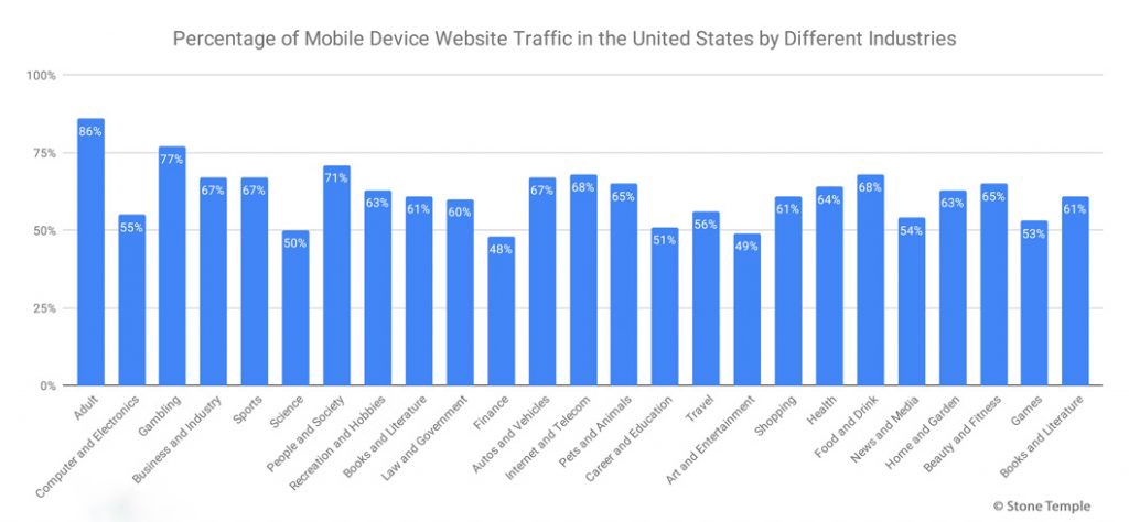
100% of our customers’ sites have a lower mobile conversion rate than desktop when we first sign them up. Why? Perhaps because when we check our sites, we do so on our computers and not using our mobiles. But, a huge portion of your site’s visitors is using their mobile devices to visit your site.
That number ranges from around 48% to about 86% – depending on your industry and location.

In the US, 48.79% of all searches in 2018 were conducted through a mobile device.
Most of you can increase the number of leads you get by simply looking at the mobile version of your site and seeing if you can find what you are looking for easily. Put yourself in your customers’ shoes and view your site from their perspectives.
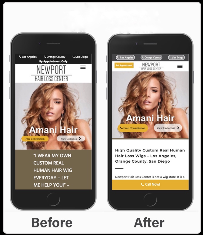
Here is an example of a change our team made for a customer’s mobile version, which effectively increased its conversion rate by 300%.

Mobile Specific Suggestions
Use Top of the Fold Wisely
You only have a few seconds to grab your visitor’s attention with your message. On desktop, you have more room to play with. Mobile, on the other hand, is limited in space. Use the top of the fold space wisely and deliver your main message and call-to-action right at the very top of the screen.
Smaller Top Banner
Since space is limited on a mobile screen, you want to use a very narrow banner at the top. You can play with the image sizes as well as their darkness to focus the space on your main message and call-to-action.
Always use a hamburger drop-down menu for mobile versions (this is the suggested menu for desktop versions in Accelerated Mobile Pages (AMP) as well).
Smaller Margins Are Better
Since your space is limited on mobile versions, it’s crucial to use the space wisely. Having large margins on the sides makes your page longer and more difficult for your readers to consume. I use 2% margin whenever optimizing for mobile versions.
For images, I don’t use margins at all and extended the width to 100% of the screen width. This gives your mobile version a better look and saves you space.
Have A Simplified Mobile Site
Mobile visitors seem to be looking for quick info and don’t have as much patience as desktop visitors. Also, because of screen-size limitations mobile visitors end up having to scroll down significantly to read your site’s entire content.
Therefore, Accelerated Mobile Pages (AMP) principles suggest that you shorten your site’s content for mobile visitors.
Add A “Call-Now!” Sticky
We tested and found out that adding a sticky to the bottom of your mobile version with a simple “Call Now!” text increases your site’s conversion rate. There is a “Simple Call Now Sticky” plugin for WordPress you can use.
This is just the beginning of your venture into conversion rate optimization. We will post more articles as we learn and test more, and will update our ebook (to be published soon).
If you want professional help increasing your site’s conversion rate, feel free to call us +1-971-248-0953 or sign up on our site for our pay-per-lead SEO program (which includes conversion rate optimization (CRO)).


