You cannot improve what you cannot measure correctly.
Before applying any of the strategies on this page, make sure you're working with your true conversion rate — not the inflated number from Google Analytics that counts bot traffic and spam calls as "conversions."
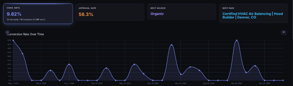
Once you have accurate data from a system like Despora.ai — one that filters local traffic and verifies real leads — these five strategies will measurably improve your conversion rate. We've tested every one of them across dozens of client sites.
1. Site Speed — The Single Biggest Factor
In our testing across client sites, speed has the most measurable impact on conversion rate of any single optimization. It's not close.
The research backs this up:
- Every 1-second delay in page load time results in a 7% reduction in conversions (Akamai / Google)
- 53% of mobile users abandon a site if it takes longer than 3 seconds to load (Google, 2025)
- A 4.42% drop in conversion rate for every additional second between 0 and 5 seconds (Portent)
- Sites that load in 1 second have conversion rates 2.5x to 5x higher than sites loading in 5–10 seconds
- The bounce probability increases 32% when load time goes from 1 to 3 seconds, and 90% when it goes from 1 to 5 seconds (Google)
Mobile speed matters most
For local businesses, the majority of search traffic comes from mobile devices. A potential customer searching "plumber near me" on their phone while standing in their flooded kitchen is not going to wait 4 seconds for your site to load. They'll tap the back button and call your competitor.
Google has operated on mobile-first indexing since 2019 — it indexes and ranks the mobile version of your site, not the desktop version. If your mobile site is slow, your rankings suffer and your conversions drop.
What "fast" means in 2026
Google's Core Web Vitals define "good" performance as:
| Metric | Good | Poor |
|---|---|---|
| LCP (Largest Contentful Paint) | Under 2.5s | Over 4.0s |
| CLS (Cumulative Layout Shift) | Under 0.1 | Over 0.25 |
| INP (Interaction to Next Paint) | Under 200ms | Over 500ms |
Our client sites load in under 1 second on mobile and score 100/100 on Google PageSpeed Insights. That's not just a vanity score — it's a conversion rate advantage.
Read our full website speed optimization guide →
2. Give Visitors What They're Looking For
This sounds obvious, but it's the most common mistake we see on local business websites: the content doesn't match what the visitor searched for.
Bait-and-switch kills conversions
If someone searches "emergency roof repair in Denver" and lands on a page about general roofing services that mentions emergency repair in one sentence at the bottom — they'll leave. They searched for something specific, and you didn't deliver.
Every high-intent search query should have a dedicated page that directly answers the question. Not a generic services page that tries to cover everything. Not a homepage that mentions 15 different services. A specific page that says: yes, we do exactly what you're looking for, and here's how to contact us.
Content mismatch indicators
If you see these patterns in your analytics, your content probably doesn't match visitor intent:
- High traffic, low conversion on specific pages — people are arriving but not finding what they need
- High bounce rate on service pages — visitors leave immediately because the content doesn't match their search
- Short time-on-page — visitors scan the page, don't find relevance, and leave
What to do
- Create dedicated pages for each specific service you offer, not one catch-all page
- Match the page title and H1 to the exact search query you're targeting
- Put the most important information — what you do, where you serve, how to contact you — above the fold
- Include real examples, photos, and case studies that prove you've done this work before
3. Calls-to-Action — Not Overdone, Not Underdone
A visitor who is ready to become a customer needs a clear, easy path to contact you. If they have to scroll through 2,000 words to find a phone number, you've lost them. If every other sentence is a blinking "CALL NOW" button, you've annoyed them.
The right balance
- One primary CTA per page — typically a phone number and a contact form
- Visible above the fold — the visitor should see how to contact you without scrolling
- Repeated once more at the bottom of the page — for visitors who read through the content and are now ready to act
- Click-to-call on mobile — tapping the phone number should immediately initiate a call, not copy text to clipboard
Both forms and phones
Not every customer wants to call. Some prefer to fill out a form — especially for non-urgent inquiries or after business hours. Having both a phone number and a contact form improves conversion rates because you're not forcing visitors into a single channel.
What not to do
- Don't use pop-up CTAs that block the content — they increase bounce rate
- Don't have too many options (call, text, chat, email, form, WhatsApp, Messenger) — decision fatigue lowers conversion
- Don't hide your phone number behind a "Contact Us" link — put it in the header, visible on every page
- Don't use generic CTA text like "Submit" — use specific language like "Get a Free Quote" or "Schedule an Inspection"
4. Site Structure and UX
If a visitor can't find what they're looking for within a few seconds, they'll leave. Site structure — how your content is organized and how visitors navigate between pages — has a direct impact on conversion rate.
Clear navigation
Your navigation should tell a visitor exactly what you do and where to find it. Every service should be one click away from the homepage. If a potential customer has to click through three nested menus to find "Commercial Roof Repair," you've already lost them.
Breadcrumbs
Breadcrumbs (the path display like Home > Services > Roofing > Emergency Repair) serve two purposes:
- They show visitors where they are in your site hierarchy
- They let visitors easily navigate back to a parent page without hitting the back button
Sites with breadcrumbs have lower bounce rates because visitors can explore related services without getting lost.
Silo structure
A well-organized site uses a silo structure — a hierarchical organization where related content is grouped together and linked internally. This helps both visitors and search engines understand your site.
For example:
Services
  └── Plumbing
        ├── Emergency Plumbing
        ├── Drain Cleaning
        └── Water Heater Installation
  └── HVAC
        ├── AC Repair
        └── Furnace Installation
Each service page links to its children, and children link back to the parent. Visitors can move through related content naturally, and Google understands which pages are authoritative on which topics.
Mobile UX
On mobile — where most local searches happen — UX is even more critical:
- Buttons must be large enough to tap (minimum 48x48 pixels)
- Text must be readable without pinching to zoom (minimum 16px body text)
- Forms should be short — name, phone, brief message. Don't ask for 10 fields on mobile
- The phone number should be sticky in the header — always one tap away
The data proves mobile matters more
We measure mobile vs. desktop conversion rates separately in Despora. For one of our clients — a commercial kitchen hood company in Denver — the difference is dramatic:
Desktop — Local Traffic:
3.10% — 4 leads from 129 desktop sessions, 66.7% approval rate
Mobile — Local Traffic:
9.09% — 3 leads from 33 mobile sessions, 80.0% approval rate
Mobile converts at nearly 3x the rate of desktop, with a higher approval rate. Mobile visitors are on a job site, searching with immediate intent. Desktop visitors are browsing and comparing.
If you're not measuring these numbers separately, you're averaging two very different behaviors into one misleading metric — and making optimization decisions based on that average.
5. Clean, Modern Design
Design is not just aesthetics — it's a trust signal. Visitors make snap judgments about your business based on how your website looks. A dated, cluttered design signals "this business doesn't invest in itself." A clean, modern design signals professionalism and credibility.
What the research shows
- Adding human connection elements — real photos of your team, customer testimonials with names and faces — increases conversion rates by 40% to 80% (Basecamp A/B testing study)
- Clean interfaces with high contrast and clear visual hierarchy reduce cognitive load, allowing visitors to focus on the content and the CTA instead of trying to figure out the layout (Nielsen Norman Group)
- Simplified interfaces with fewer visual distractions have shown conversion rate improvements of 35% or more in A/B tests — primarily because simplification increases content focus and contrast
Design principles that improve conversion
- Use white space to separate elements instead of borders and dividers — it reduces visual clutter and makes content easier to scan
- Flat design — remove unnecessary shadows, gradients, and decorative elements. Every visual element should serve a purpose
- Consistent color palette — use one accent color for CTAs and interactive elements. Don't make visitors guess what's clickable
- Real photography — use actual photos of your work, your team, and your location. Stock photos reduce trust. Customers can tell the difference
- Typography matters — use clean, modern typefaces at readable sizes. Avoid decorative fonts, all-caps paragraphs, or fonts smaller than 16px
- Avoid visual clutter — every animation, banner, slider, and widget competes with your CTA for attention. If it doesn't help the visitor take action, remove it
The trust equation
For local businesses especially, your website is often the first impression. A visitor comparing two plumbing companies — one with a clean, professional site that loads instantly, and one with a dated WordPress theme full of stock photos — will call the first one even if the second one is a better plumber.
Design builds trust. Trust drives conversions.
Measure the Impact
Every optimization on this page is measurable. After implementing changes, track the results in Despora:
- Before: Note your true conversion rate (true leads ÷ local traffic) per page
- After: Give the changes 2–4 weeks of traffic, then compare
- Per-page analysis: See which specific pages improved and which didn't
This data-driven approach means you never have to guess whether a change worked. You see the numbers move — or you don't, and you try something else.
The businesses that win at CRO are the ones that measure correctly, change one thing at a time, and let the data tell them what works.
Start With the Right Number
If you take one thing from this page, let it be this: don't optimize based on bad data.
Get your true conversion rate first. Understand which pages are actually converting and which aren't. Then apply these strategies to the pages where the data shows the biggest opportunity.
That's how you turn a 2% conversion rate into a 10% conversion rate — without spending a dollar on ads.